SkyEye Web Application
Overview
“SkyEye” is on a mission to democratize satellite film and imaging. What was once a high-tech process is now simple, affordable, and accessible to everyone.
Getting satellite images for a specific location used to be high-tech, less accessible, and expensive to the general public.
The web application created streamlined and straightforward steps for users to find existing satellite images in its database and task satellites for future images at affordable prices.
Role
Team of 2 for the UX/UI
Team of 4 for the Usability Testing
Timeline
2 Weeks
Tools and Methods
Figma
Illustrator
User Flow
Wireframing
Style Guide creation
Usability Testing
Challenges
1 / Making Satellite Tasking Accessible to Everyone
Satellite tasking is traditionally a complex process designed for professionals in fields like geospatial analysis and defense. However, this product aims to democratize access, enabling realtors, landowners, and everyday users to leverage satellite technology for their unique needs. To bridge the knowledge gap, we developed clear, digestible guidance—integrating concise tooltips, contextual tips, and step-by-step assistance—ensuring users can task a satellite with confidence and ease.
2 / Providing Easy Access to Archived Satellite Images
In addition to tasking a satellite, users can purchase pre-existing satellite images from the archive for their selected area. This feature provides a faster and more cost-effective alternative for users who do not require real-time imagery, making high-quality satellite data more accessible and efficient for decision-making.
3 / Guiding Users Through Satellite Imaging Tools
To ensure a seamless user experience, we introduced educational insights on key satellite imaging tools, including choosing the right satellite type, adjusting cloud coverage, and modifying sun elevation. These features empower users to make informed decisions, optimizing image quality for their specific needs.
Prototype
How Might We…
inform new customers about tasking a satellite?
User Flow
Based on the project design brief and the scope it defined, we created a user flow diagram to map out each touch-points of the app's two key features - "Task a satellite" and "Find in Archive".

Low Fidelity Wireframes
Based on the user flow diagram, we further explored some design ideas for the Home and Explore pages through low fidelity wireframes.


Mood Board
We created a Moodboard to collect inspirations and set up the look and feel of the overall visual design. "Sky Eye" is about earth, sky, and space, therefore, we focused on using the blue color to echo the theme.

Style Guide
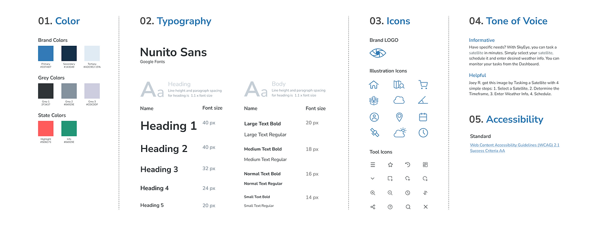
We created a UI Style Guide that brings cohesion to the app's user interface and experience. The style guide includes the below guidelines:
-
Color
-
Typography
-
Icons and illustrations
-
Tone of voice
-
The accessibility standard

Components
We also created a components library based on the style guide, which further helped us ensure consistency and replicate designs quickly by utilizing premade UI components and elements.

Usability Test
Usability Test
Methodology
The research team conducted remote interviews. They were asked to perform 3 key tasks through an online prototype and were asked rating questions regarding the helpfulness and easiness of the application.
Tasks
-
Use the SkyEye application to indicate that you want an image of “Lower Manhattan”
-
Use SkyEye to take an image of lower Manhattan
-
Find an existing image of lower Manhattan in Skyeye’s database
Goal
-
Discover key usability flaws and areas to improve
-
Discover if users can differentiate between the "Task a Satellite" path and the "Find in Archive" path
-
Evaluate helpfulness and easiness
Outcome Metrics
Most of the test participants thought the SkyEye app was easy and useful. However, there exist some issues regarding distinguishing the paths between "Task a Satellite" and "Find in Archive", which was the direct reason causing a slightly below average SEQ score.

Main Findings
We documented the feedback from the user testing on the corresponding screens, summarized the findings, and prioritized them based on their importance.

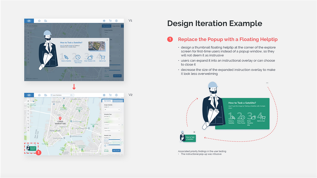
Design Iteration
I further revised the design based on the findings from the user testing. Below are three examples that document how I iterated the design based on the top findings.


